Something feels off in my apartment decor…
This post may contain affiliate links for products I love. If you click and purchase, I may receive a small commission at no extra cost to you.
Have you ever looked around at your apartment decor and thought, “something just feels off in here…”? Like something is just missing from the overall aesthetic of the space, like a missing style puzzle piece?
That's kind of where I'm at in my new apartment decorating journey, specifically in my living room. Things are looking awesome… but there's just something missing and I can't quite put my finger on it!
So in this post I'm going to try to figure out what is missing in my living room styling, and maybe you can help me figure it out in the comments!
Would you rather watch than read? Here’s the video! ↓
Let's talk about the aspects of my living room room that feel… off to me.
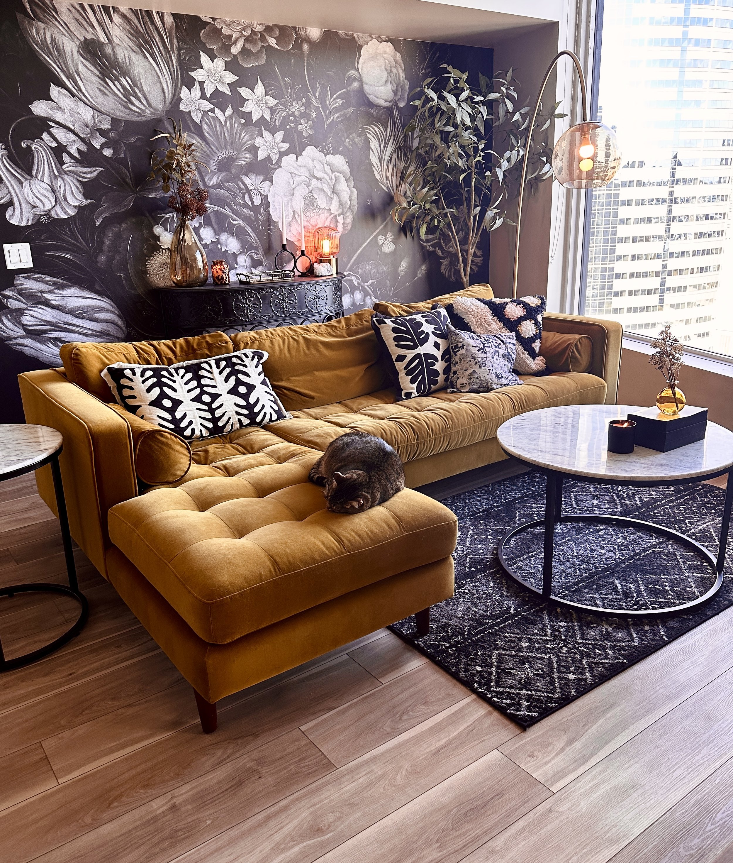
And don't get me wrong, I love my living room, especially after putting up the wallpaper - which I talked all about here. In that video, I raved about how the wallpaper has really helped me feel like my living room is finally coming together.
But you know when you’re decorating, sometimes a really good styling choice gives way to the next need? Like, the next desire for the space? In the sage words of The Rolling Stones, “I can't get no satisfaction, ‘cause I try and I try and I try and I try”.
And the wallpaper really raised the bar for the style of this living room, so I want the rest of it to rise to the occasion of its beauty. So let's keep trying!
So here's what’s not really clicking together in my living room at this point…
1. Too much light wood?
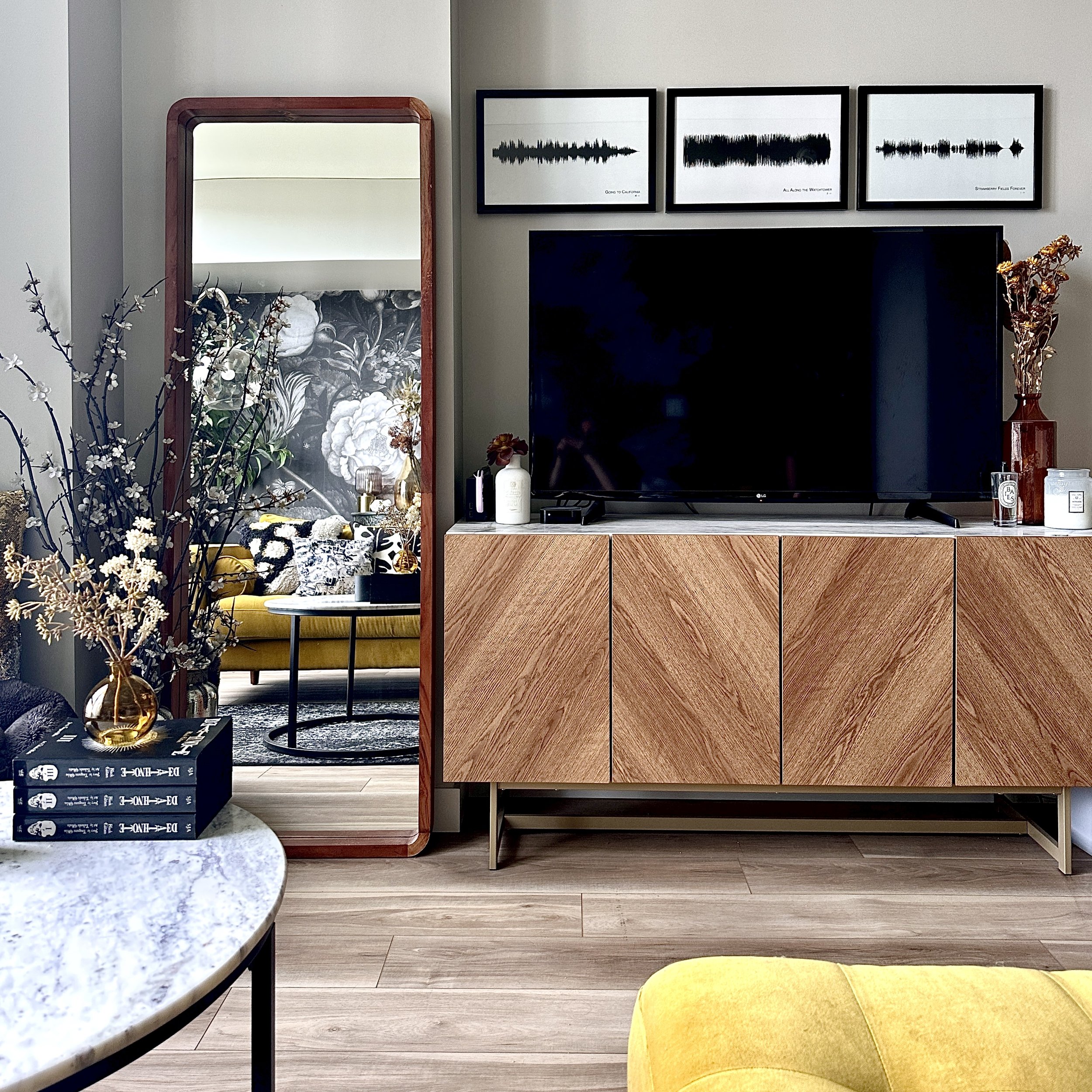
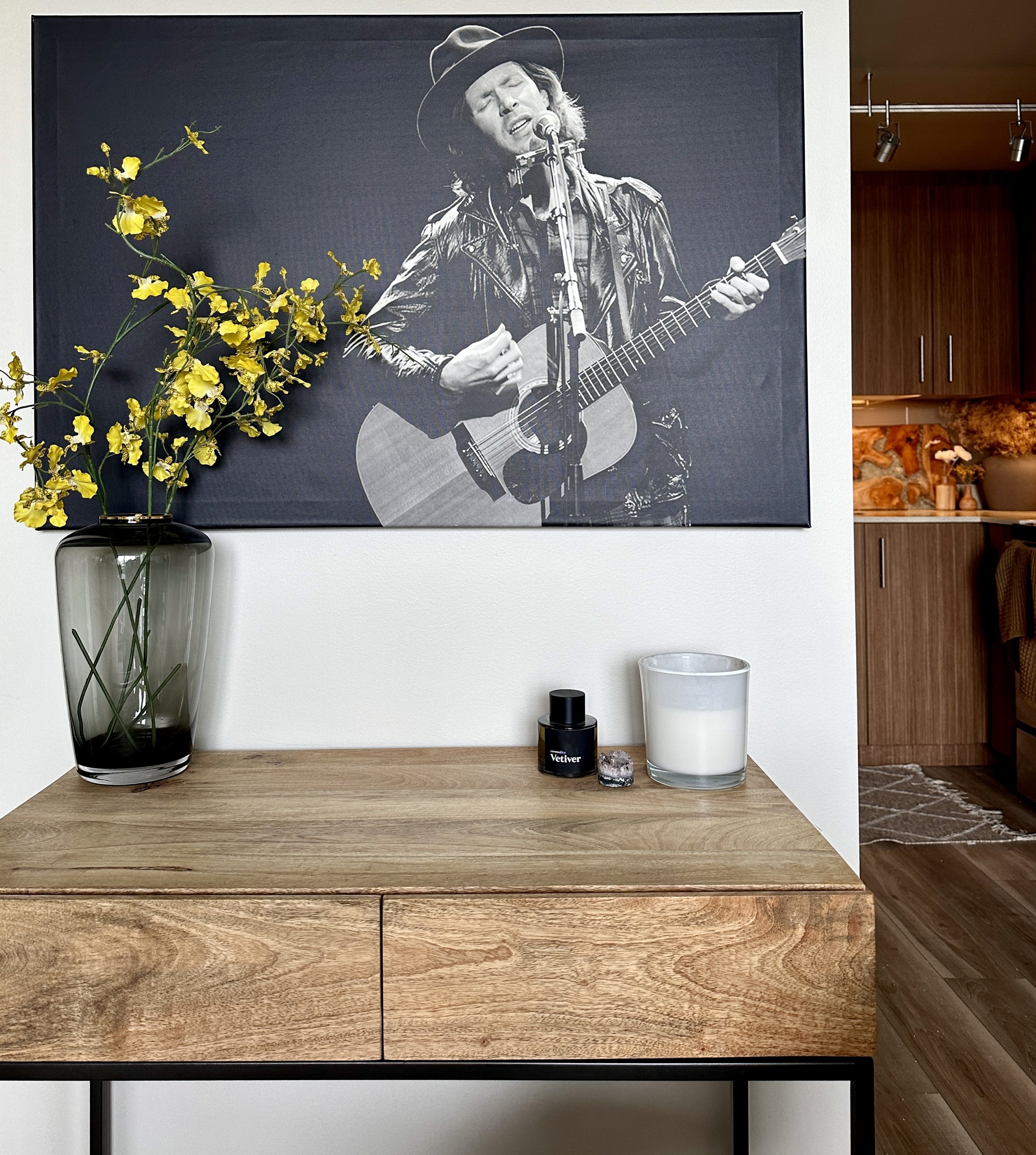
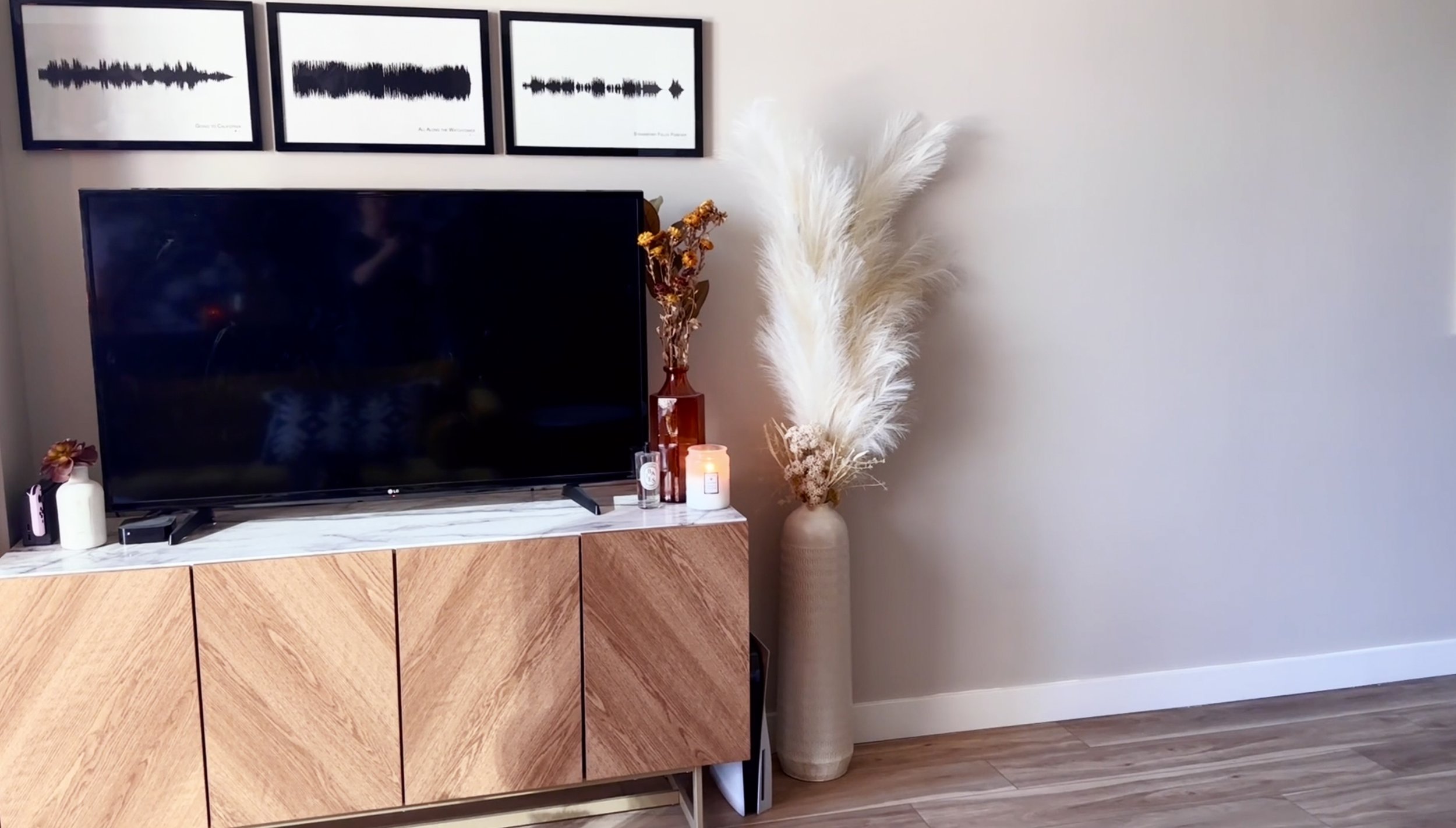
I'm wondering if the light wood in here isn't really working. My media console and desk have light wood, and I'm starting to feel like they’re creating too much yellowness when paired with my gold couch. I'm thinking there needs to be a bit more contrast, like a darker wood or more black. In the sage words of The Rolling Stones, “Paint it black.” 🙃
2. A Small Piece of Wall
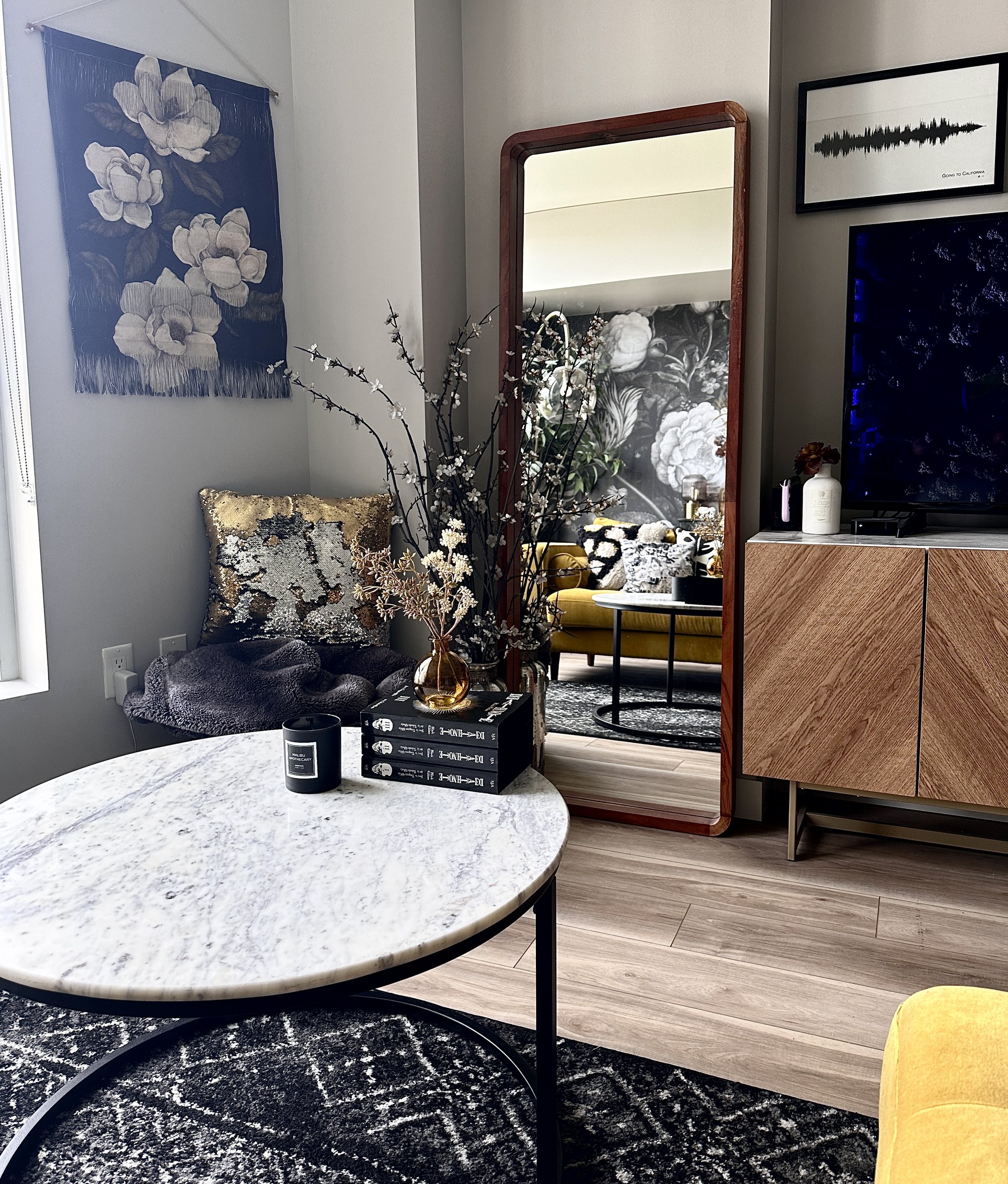
There's also this piece of wall where I currently have my magnolia wall hanging from Society6. Ultimately, I feel like the wall hanging is kind of competing with the the floral pattern of the wallpaper, which one of you pointed out in the comments of a previous video of mine. I don't disagree! I would like to figure out something better for that spot.
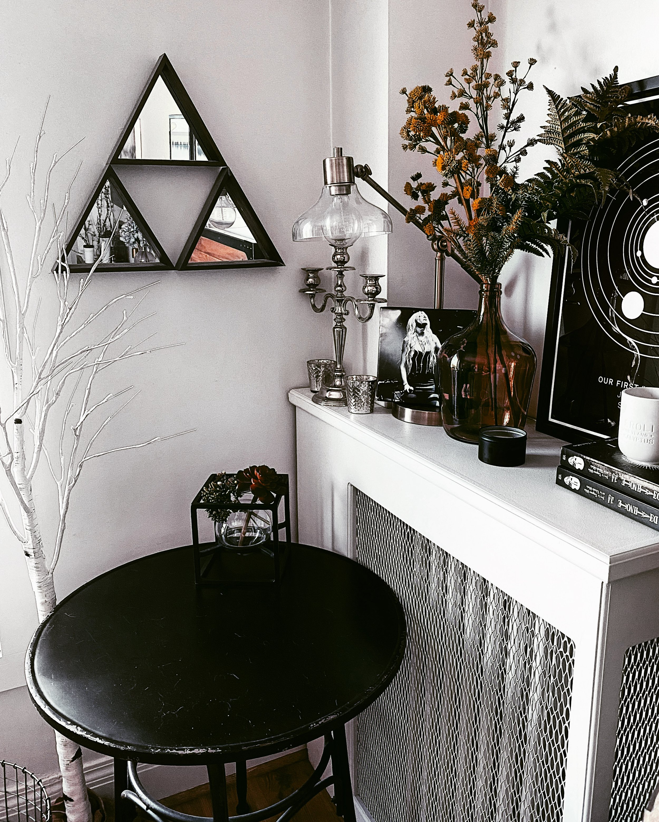
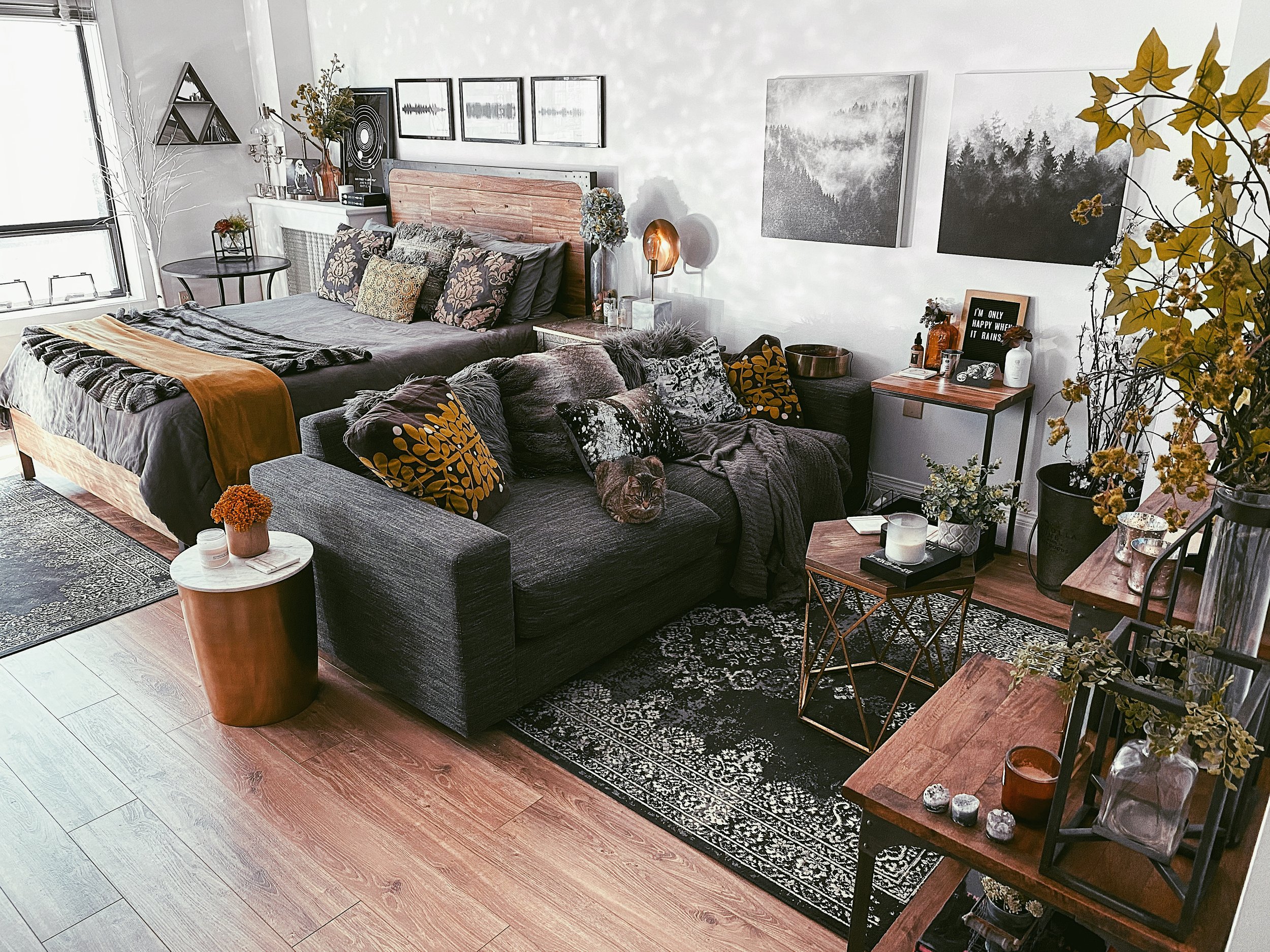
Part of me wants to put my my Triforce on that little piece of wall. It’s the 3 triangle mirrors that I shaped into the Triforce from the Legend of Zelda, which I had up in my studio apartment. But that was truly the biggest pain in the ass to hang up, and I am not sure if I am up for the task again. It was not only a physical challenge, but it was also a a mathematical challenge to get it geometrically correct, you know? Yeah… I don't know if I can put myself through that again.
3. A Big Chunk of Wall
Then of course, as you know if you watched this video, there's the empty piece of wall next to my TV I'm still trying to figure out. Right now it’s feeling like a big empty void that needs to be filled, but I can’t quite summon the inspiration for what to do there!
4. The Area Rug
If you watched this video, you know that it's been quite a journey for me to find the right rug for this living room. And I actually really like my current rug, but it is a bit on the small side. The challenge is that fitting a big area rug in here is tough because it's a small living room its angled wall makes fitting a a large area rug tricky. So I’m keeping my eye out for for the perfect rug. We'll see if I meet her someday.
5. A Window Gazing Seat
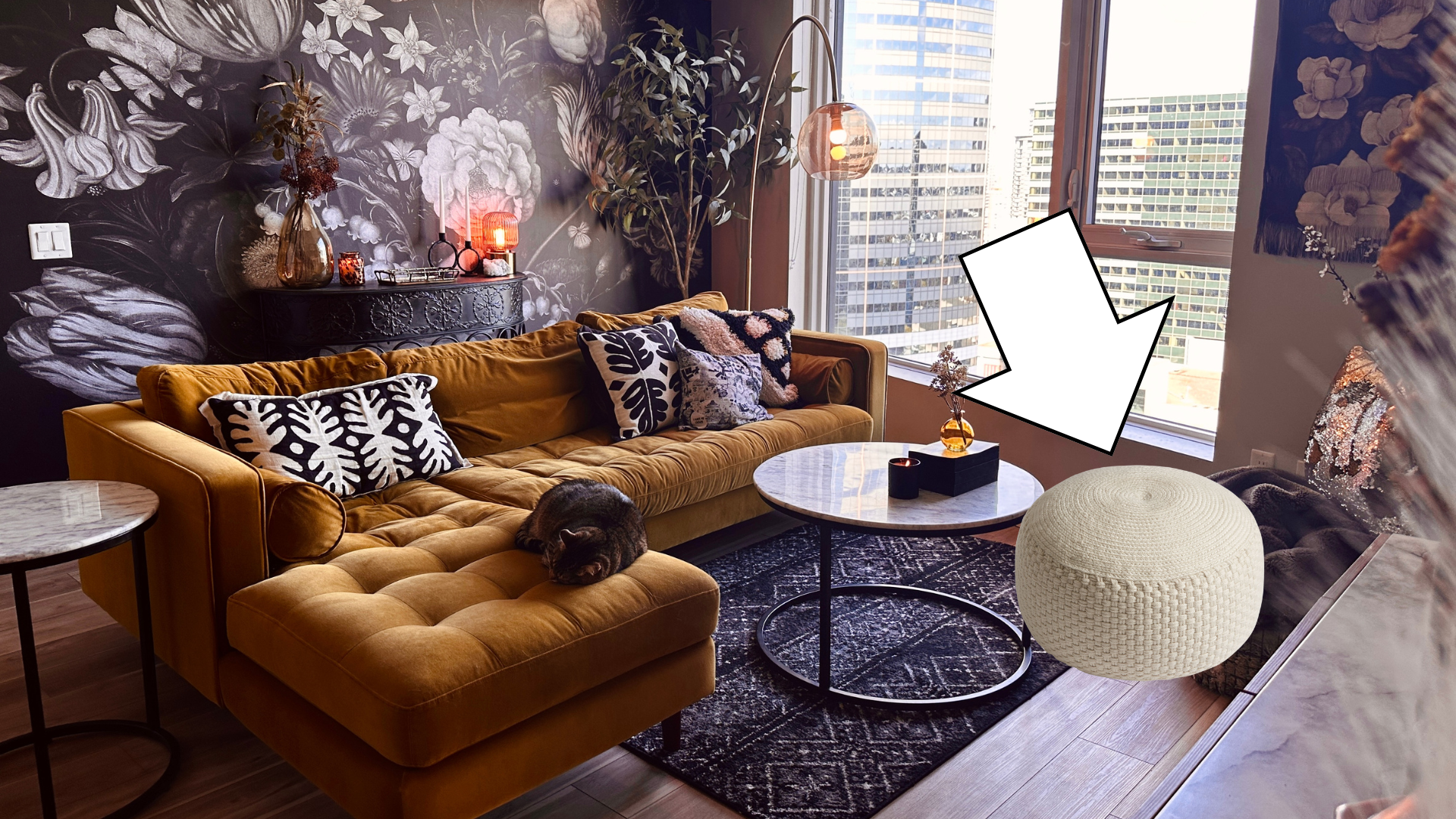
This is this is not a must-have but it would be a nice-to-have if I could figure out how to swing this. I would like to have a little something — like a pouf or ottoman — over by my window so that I can sit and look out at my view. I'm not sure if there's going to ever be the space for that, where it doesn't look completely out of place, but that is something on my radar.
So that's where I'm at with the living room right now and why it's feeling off. These are the things I'm noticing that really aren't living up to my expectations and what the living room has evolved to.
Interior styling is like training Pokémon; they're going to evolve to their next form and you have to be ready to adapt.
And really, this kind of confusion is just part of the styling process. I ran into the same thing when I was decorating my studio apartment. It's just that I didn't have a YouTube channel until I was pretty much done with my studio decorating, so you didn't see all the ups and downs of of that process.
If you run into this sort of confusing part of the styling process, know that it’s normal. It's kind of like writer's block. I just need to figure out how to write the next chapter of my space.
So let me know what you think the next chapter of my space needs in the comments! I'd love to hear your ideas.


